Project Overview
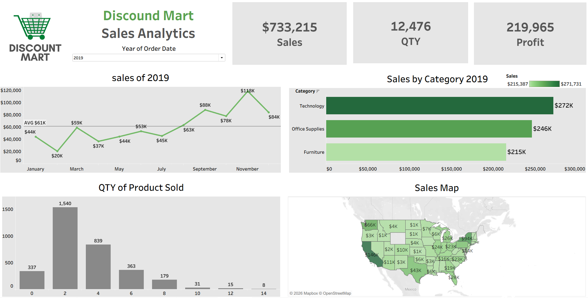
The dashboard uses clear and interactive visualizations, including KPI cards, line charts, bar charts, and a sales map, to present business performance in a simple and meaningful way.
These visuals make it easier to track monthly sales trends, compare category performance, measure quantity sold, and analyze regional sales distribution.
By organizing the data into intuitive visual components, the dashboard allows users to quickly explore insights, identify patterns, and better understand overall sales performance.